In abstract art, color is more than just a visual element — it’s a language. A silent conversation that reaches deep into our emotions without needing words.
1. Why Color Matters So Much in Abstract Art
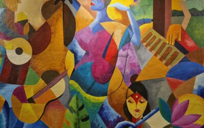
Abstract art often avoids recognizable forms. There are no faces, landscapes, or familiar objects. What remains are shape, texture, and above all… color.
Among these, color holds the strongest emotional power.
It doesn’t need explanation, yet it instantly triggers feelings.
For example:
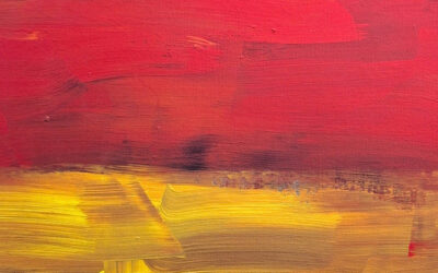
Red can feel energetic, passionate, or even aggressive.
Blue might be calming or melancholic.
Yellow can evoke warmth, joy, or even anxiety depending on how it’s used.
In abstract compositions, color becomes the primary tool to express emotional states or unspoken messages.
2. Natural and Personal Emotional Reactions
No two people see color in the same way.
Cultural background, personal experience, and emotional state all influence how we respond to a work of color-driven abstract art.
For instance, green may feel peaceful to someone who grew up near nature, but alien to someone raised in a concrete cityscape.
That’s the beauty of color in abstraction: it offers a unique and deeply personal experience to every viewer.
3. The Emotional Process Behind Creating Abstract Work
For many abstract artists, creating a painting is not about “depicting something” — it’s about expressing something.
Color becomes a means to pour out emotions that cannot be described in words.
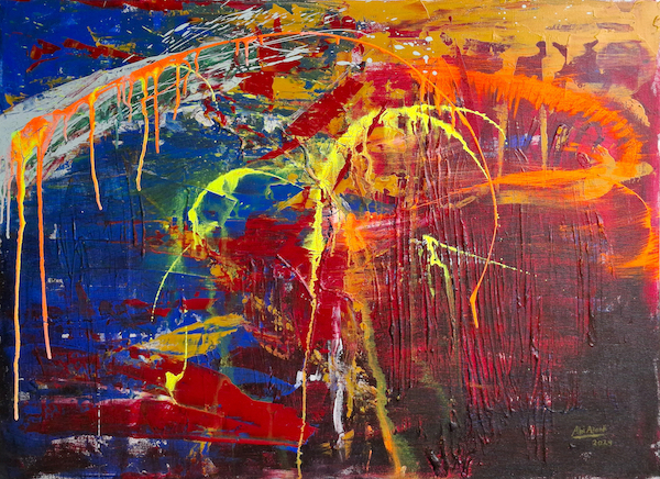
Spontaneous brushstrokes, bold palettes, or even deliberate empty spaces are all emotional choices.
Example:
An artist feeling restless might use sharp contrasts and erratic marks.
A calm mood might result in soft transitions and peaceful tones.
4. Color as Storytelling Without Words
People often ask, “What does this painting mean?”
But in abstract art, meaning is not always fixed or even necessary.
Color combinations become stories on their own.
For example:
Teal fading into soft yellow might evoke a serene early morning.
Deep purples merging with flashes of red might suggest mystery or passion.
Each viewer reads a different story.
And that’s why abstract art never grows old.
5. Color That Moves with Light and Space
One fascinating aspect of abstract paintings is how color interacts with light.
Depending on lighting conditions, the same shade may appear different:
Under natural light, blue may feel open and fresh.
Under warm indoor light, it may feel richer, deeper, even moody.
In this way, abstract color-based art becomes “alive,” constantly changing and offering new experiences over time.
6. Bringing Emotional Color Into Everyday Life
People often choose abstract artworks based on their emotional effect.
It’s not just decoration — it’s a psychological presence.
Examples:
Warm reds in a dining room can bring energy.
Soft greens in a home office can calm the mind.
Deep blues in a bedroom encourage peace and introspection.
Color is more than aesthetic — it becomes emotional energy in the room.
7. To Feel, Not to Analyze
The challenge with appreciating abstract art is letting go of the need to understand.
It’s not a puzzle to be solved — it’s a feeling to be experienced.
Abstract color-based art doesn’t ask to be figured out — it asks to be felt.
When we allow color to bypass logic and enter the heart, we find something real: connection, resonance, or even healing.
Conclusion
Color in abstract art is not decoration — it’s expression.
It’s a language of emotion, a doorway into the unseen world of feeling.
By allowing color to speak, we experience art in a more intimate and honest way.
Because sometimes, the feelings that move us most deeply come from colors that have no name.