Abstract art is often seen as a world of free forms. But behind that freedom, color plays a crucial role—sometimes even stronger than the form itself. Why can color be so influential in abstract art? And how can it speak directly to our emotions?
1. Color Needs No Words
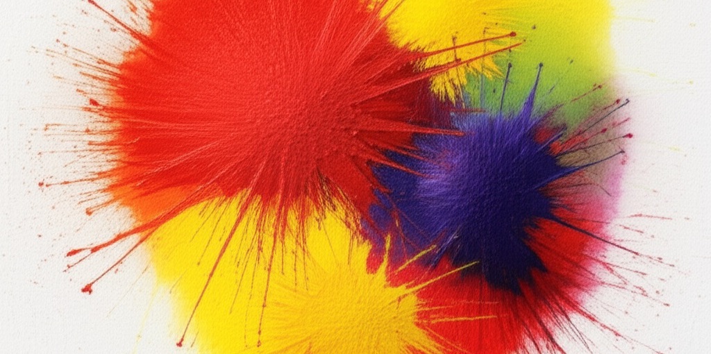
When looking at an abstract painting, we may not find familiar shapes. But color? It directly touches our emotions, even without us realizing it. For example:
- Blue often gives an impression of calmness.
- Red can evoke feelings of excitement or even anxiety.
- Yellow brings light and optimism.
Color “speaks” without narration. It communicates through feeling—not logic. In abstract art, this power is maximized.
2. Color Composition Directs Attention
Even without clear objects, abstract works still have direction. The composition of colors can make our eyes follow a certain flow. For example:
- A smooth gradation from dark to light gives a sensation of movement.
- Contrasting colors can create dynamic visual “tension.”
Unconsciously, we are “guided” by color as we explore an abstract work.
3. Color Represents the Artist’s Emotions
In figurative art, an artist can express sadness through a character’s face or a gloomy landscape. But in abstract art, that expression comes from the choice of color.
Real examples:
- An artist feeling hopeful might pour a lot of bright and cheerful colors onto the canvas.
- When experiencing inner conflict, their color palette might be dark, sharp, or even seem chaotic.
Color becomes an emotional record of the artist’s creative process.
4. Everyone Can Feel Differently
What’s interesting about color in abstract art: there is no “right” interpretation.
- Someone might see purple as a symbol of spirituality, while another feels it as nostalgia.
This is what makes abstract art very personal. The colors in a painting are not just about what the artist wants to convey, but also about what the viewer feels.
5. Choosing Colors for the Right Space
In the context of home decoration, the selection of abstract works based on color becomes very important.
Application examples:
- For a workspace: choose works with energetic colors like orange or yellow.
- For a bedroom: look for those dominated by soft blues or gentle greens to calm the mind.
- For a living room: combine warm and neutral colors to feel inviting yet balanced.
Abstract art chosen with attention to color can enhance your daily mood.
Conclusion
Color in abstract art is not just an aesthetic element. It is a wordless language, a bridge between the artist’s emotions and the viewer’s feelings. And when color is chosen with the heart, it can change the atmosphere of a room—even change someone’s day.
So, when you see an abstract painting, don’t rush to ask: “This is a picture of what?”
Try asking: “How do I feel?”
If you want to find abstract artwork that speaks through color, explore our collection—each painting is made with feeling and meaning that doesn’t always need to be explained.